
ToyFight.co
UX Audit
Home Page

ToyFight
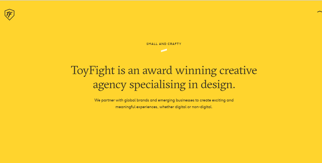
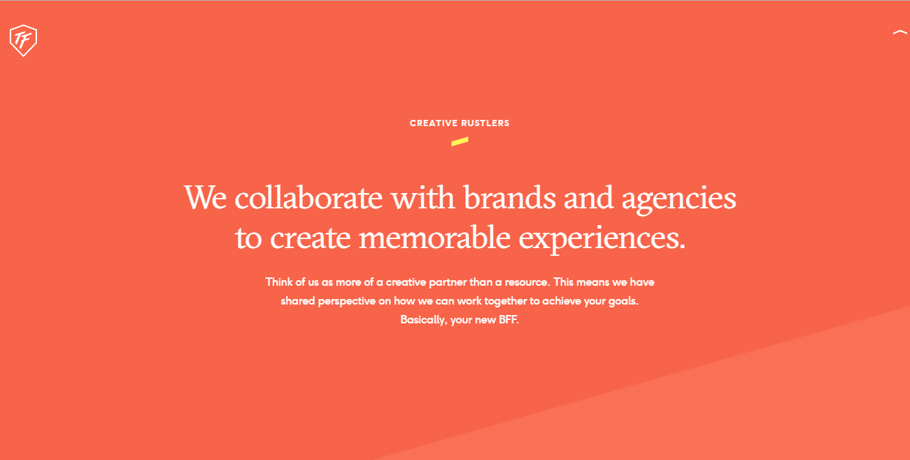
When the user entered ToyFight, their attention was caught by the graphics and the animation. The graphics overlapped with the top menu and the scroll down arrow, making it hard to read and not knowing that they had to scroll down.
|
|
ToyFight
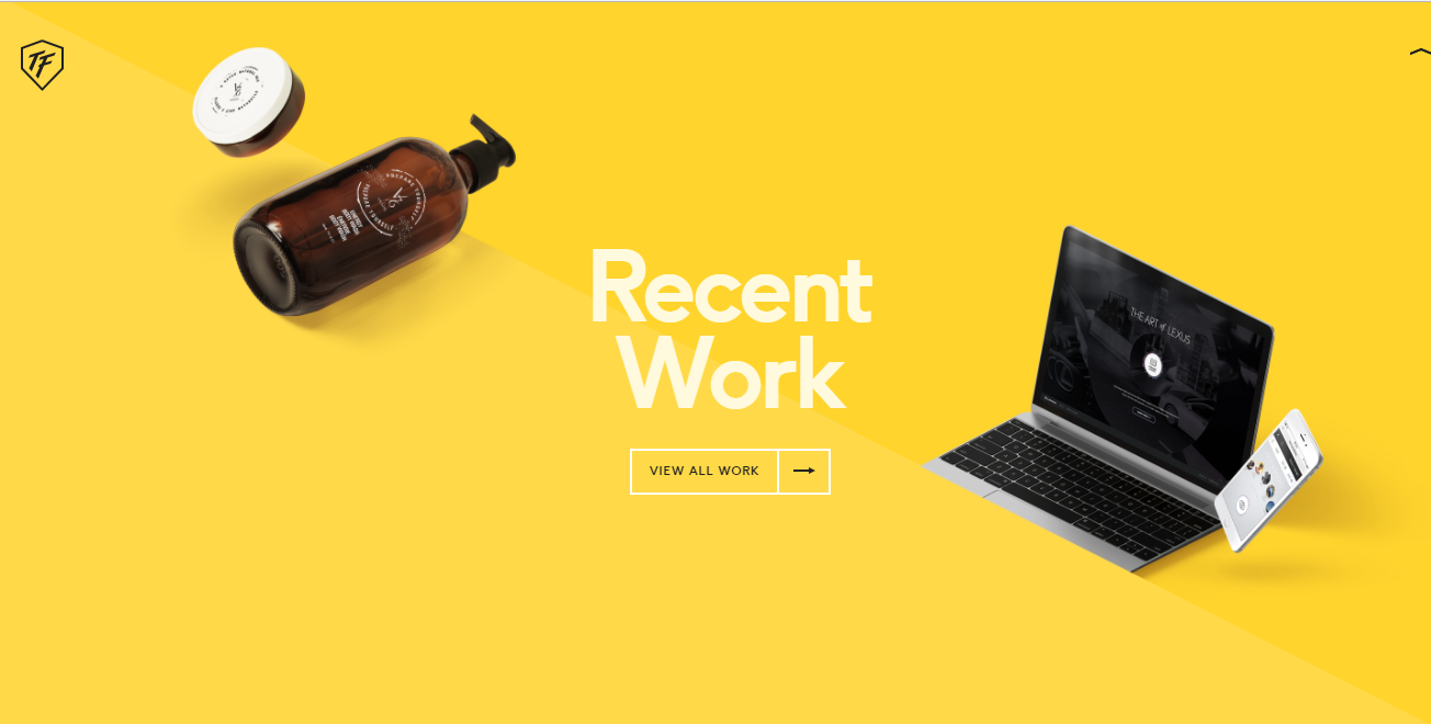
Scrolling down, there was a short summary of who they were and what they did. After that, a preview of their recent works and a button leading the user to view more information about the works.

ToyFight
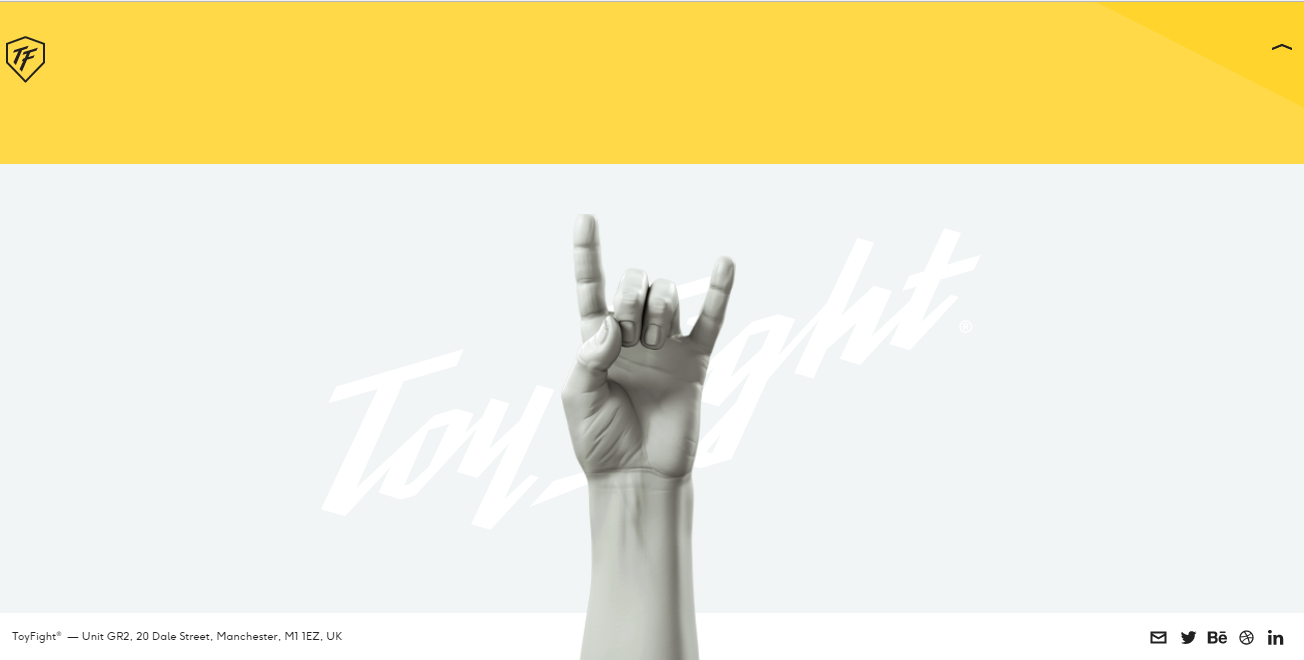
Once the user reached the end of the bottom of the page, there was a graphic of a raised arm with its hand in a "Rock On" pose, at the bottom in tiny fonts were the contact information of ToyFight, which should be more noticeable due to its importance.

Cum. Creative
Upon entering Cum. Creative, the splash page was really colourful. The top menu was in a simplistic area of the background, so the words could be seen clearly. There was an scroll down indicator arrow that was noticeable but not so much that it would clash with the splash page.

Cum. Creative
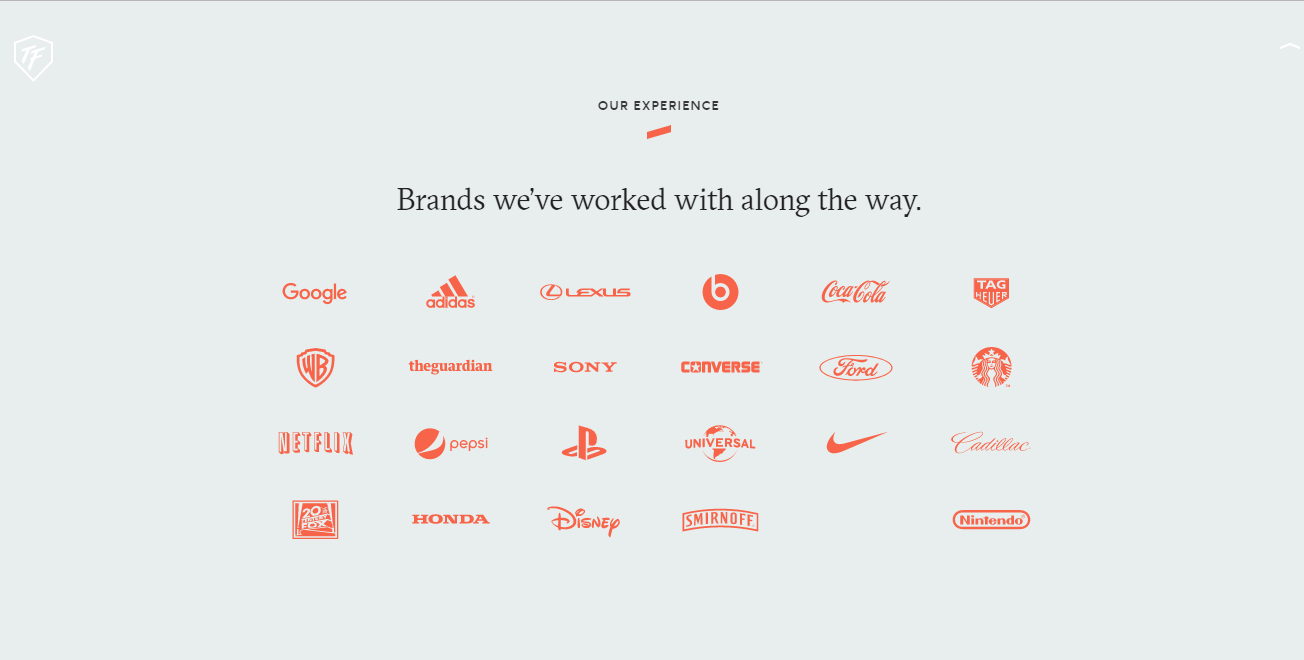
At the bottom of the screen was the contact information of Cum. Creative which remained on the screen when scrolling down. When the user scrolled down, a black overlay covered the splash screen. On the top was the meaning of their company's name and what the company did, but it was almost missed as it was small and on the very top. The content that caught the user's eye was the client list of Cum. Creative.

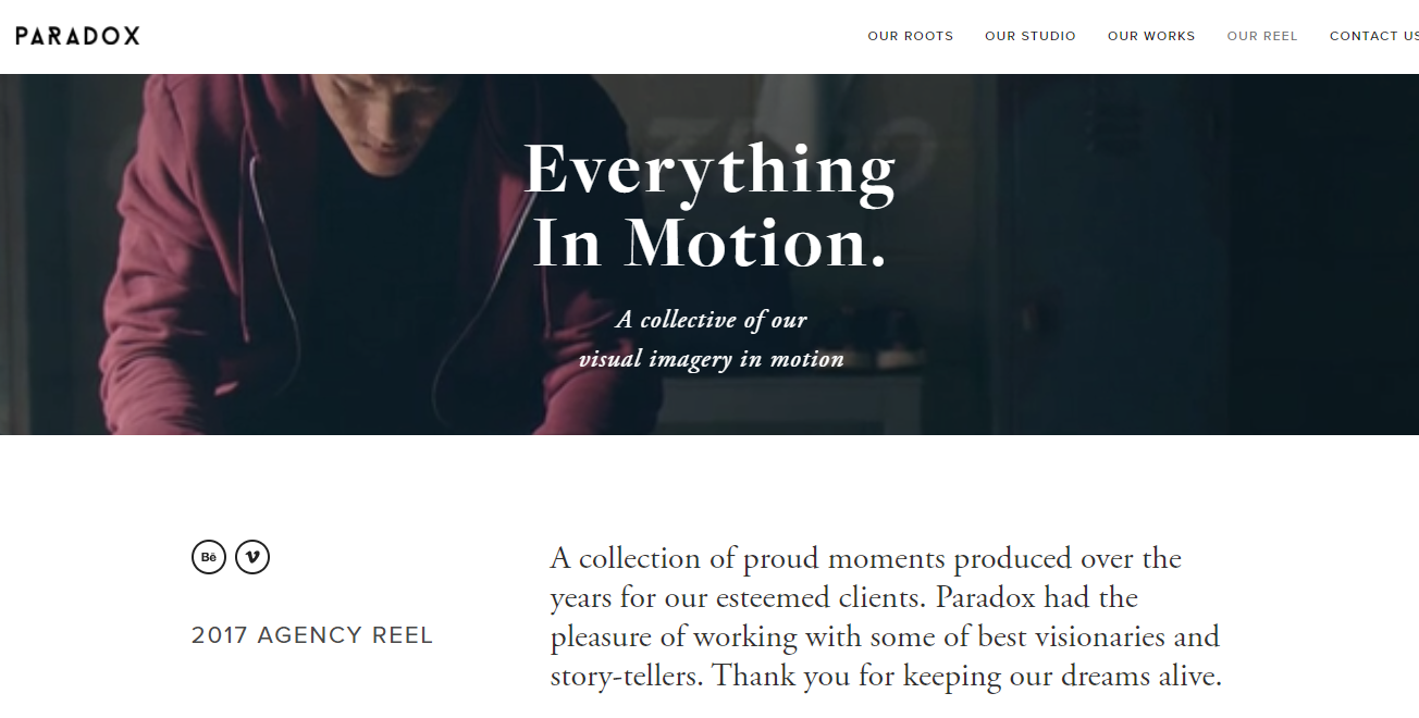
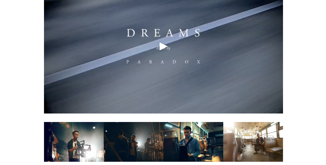
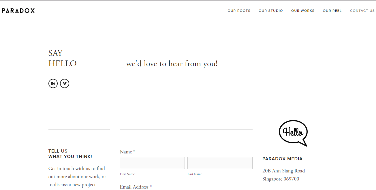
Paradox
When the user entered Paradox, there was a slow animated GIF header with a slogan that was readable and probably the company's motto. There was no scroll down indicator arrow but a section header that looked cut off which hinted to user there was more content below.
|
|

Paradox
There was a short summary of what the company did and a list of services the company provided. After that, there was a quote from the founder of the company along with a button which would lead the user to read the testimonials clients had written for them, increasing their legitimacy.
|

|
Paradox
At the bottom, the website had the contact information and social media platforms of Paradox with Google maps and images to entice the user to look. As great as it was to have a lot of information about the company, it appeared heavy for the homepage.
About and What Pages
When looking for more information about the company's team, Cum. Creative did not have those sections, only displaying their client list and portfolio. As the portfolio was another comparison, it would be discussed later in the audit.
|
|
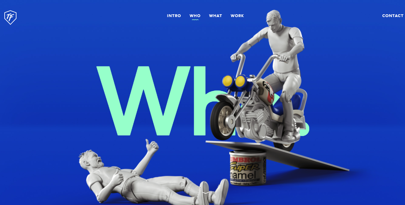
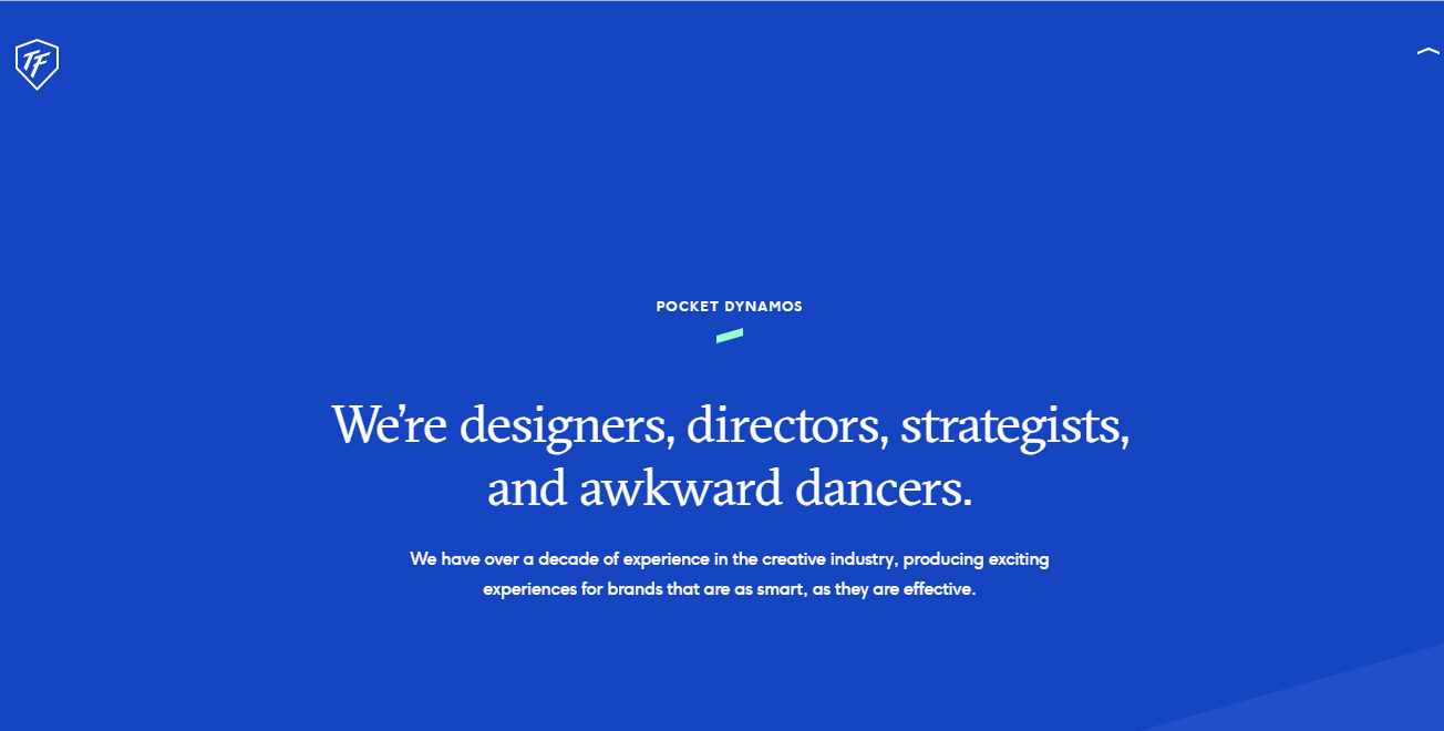
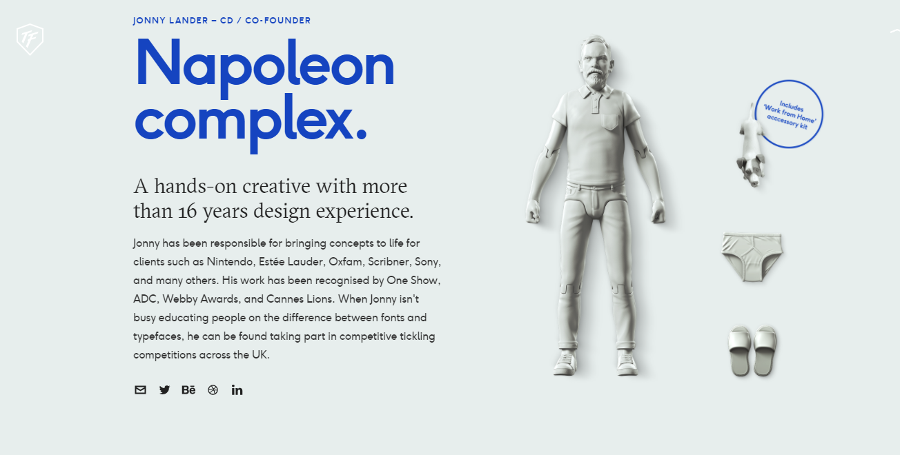
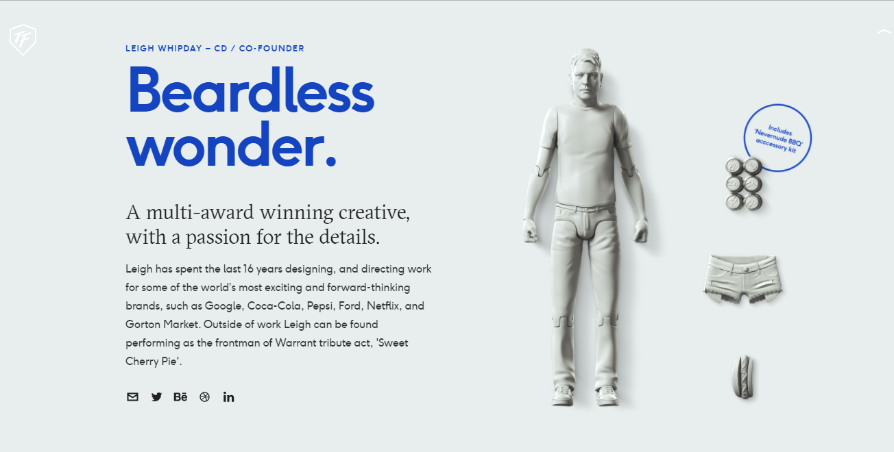
ToyFight's Who Section
|
|
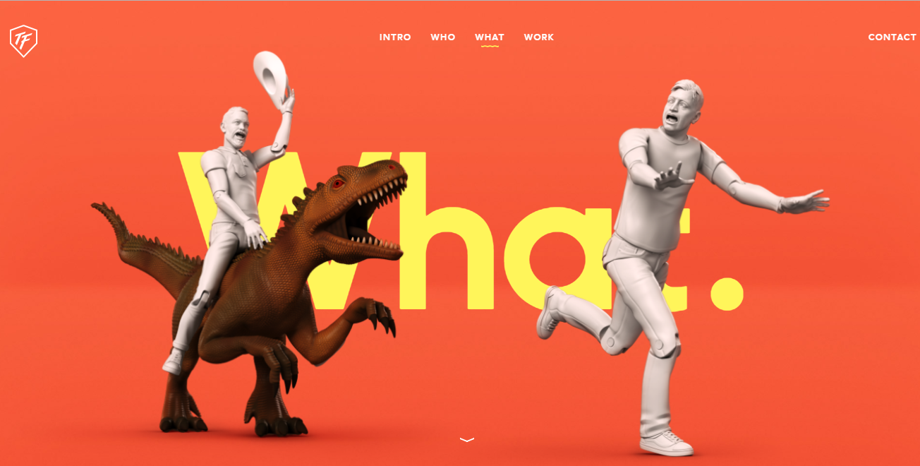
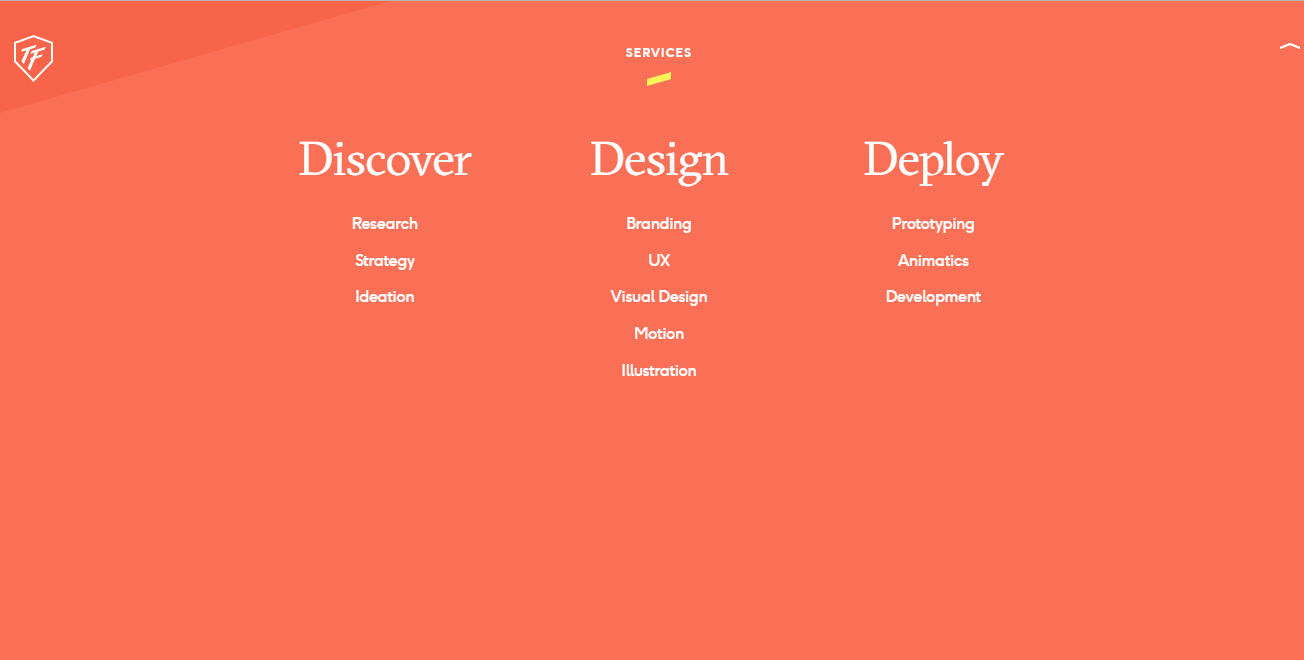
ToyFight's What Section
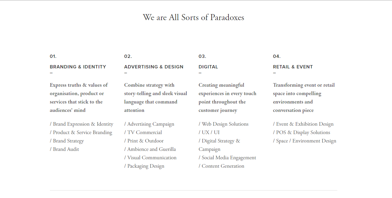
ToyFight had graphic screens for every section. The user was required to scroll down to get the information. There was a short and interesting summary which related to the section the user was in.
|
|
ToyFight's Who Section
|
|

ToyFight's What Section
In the Who section, the introduction of what the team was like was shown and as the user scrolled down further, they were introduced to the founders of ToyFight, represented in toy mannequins which were interesting. In the What section, the company's services were shown and at the bottom, the client list they had, and the number of awards they had won.
|
|
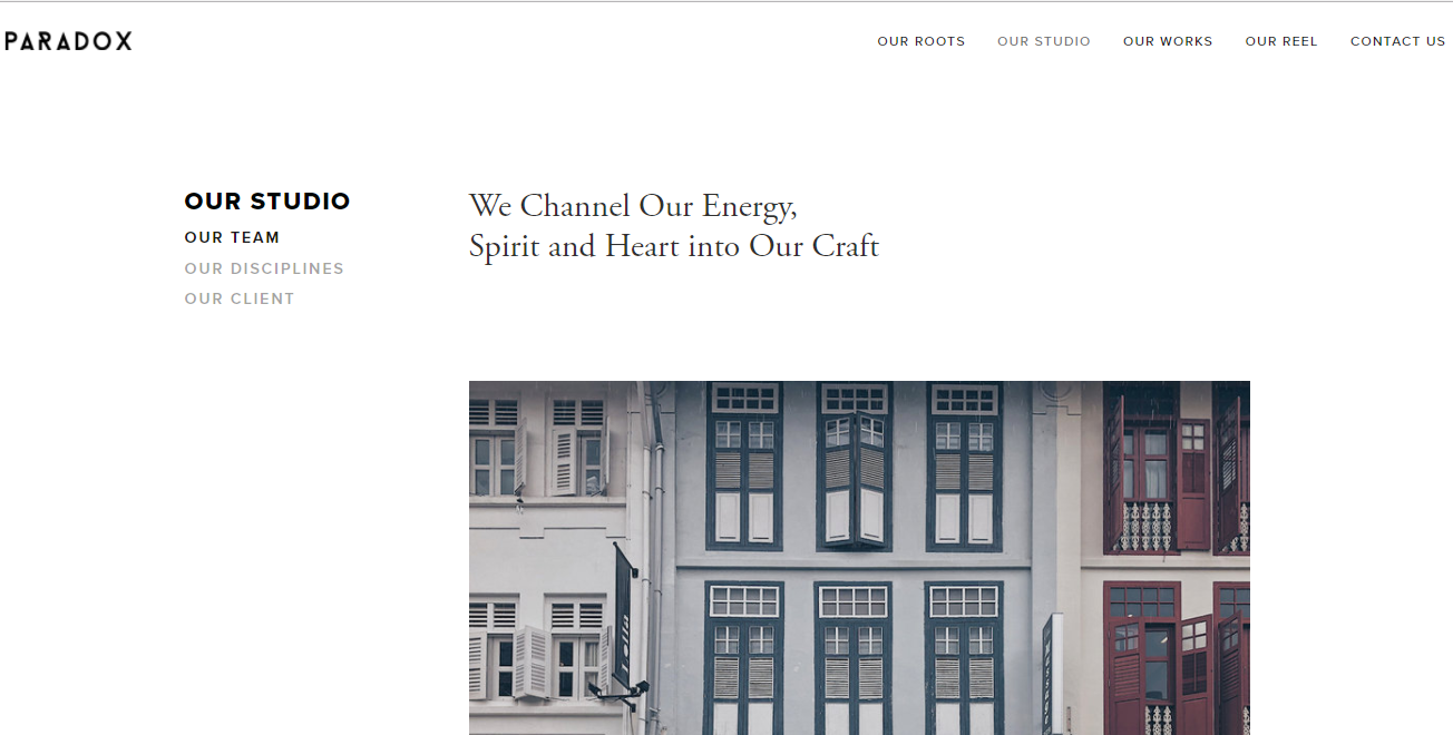
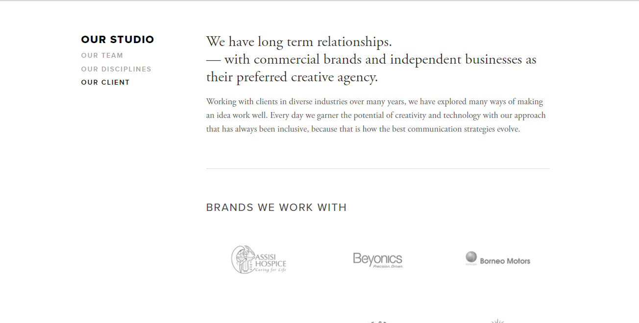
Paradox's Studio Section
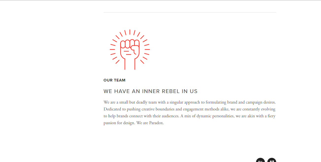
Paradox combined the Who and What sections into one. Paradox's Studio section had three subsections, Our team, Our Disciplines and Our Clients. In Our Team, they talked about where they were located and what was their team like.
|
|
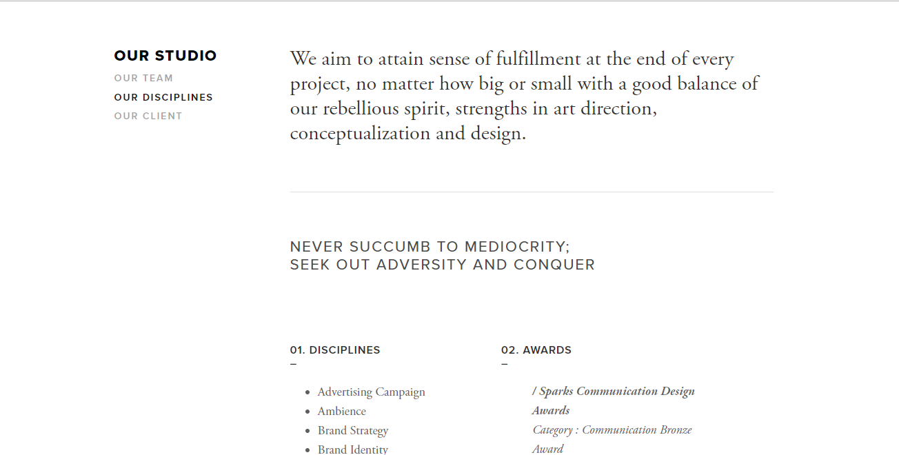
Paradox's Studio Section
In Our Disciplines, they showed the services they provided and the awards they had won. In Our Clients, they showed the list of their clients and that they had a long term relationship, which helped show their reliability. Though the text was short, it would have been nice to have some graphics to make the website more interesting.
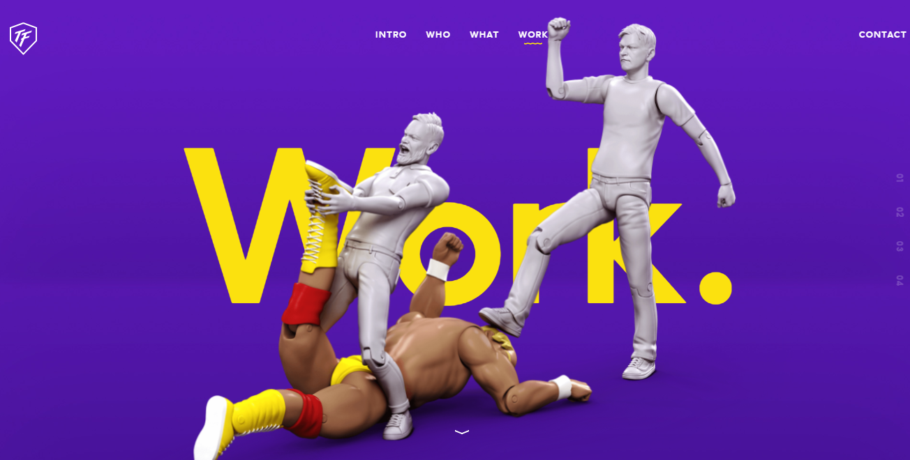
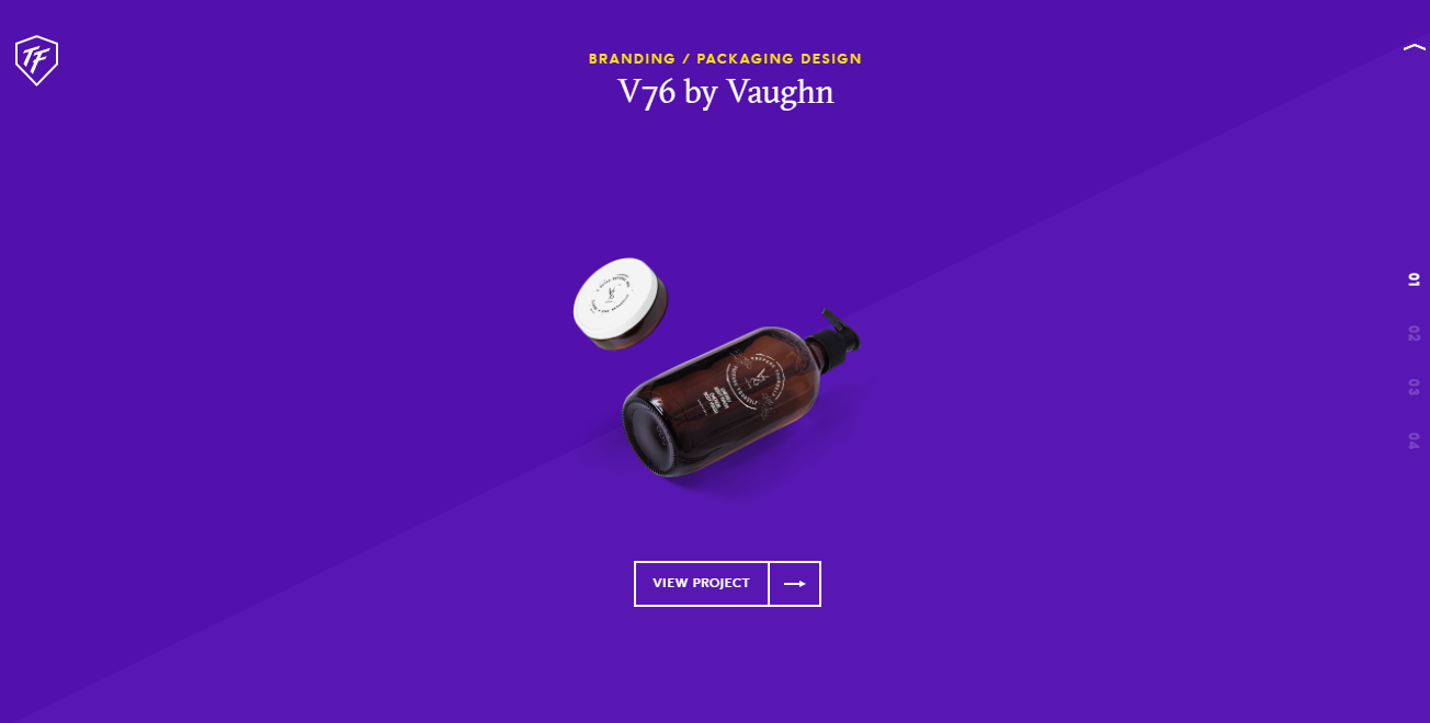
Work Page
|
|
ToyFight
For ToyFight, when the user proceeded into "Work", a graphic page appeared and you have to scroll down for the information again. The work appeared with animation. They indicated which company was the product done for and what was the service provided for this work. When the cursor hovered over the "View Project" button, there was animation, enticing user and also telling the user it was clickable.

Cum. Creative
For Cum. Creative, in "Work" section, their works were shown by with graphics and the company's name, project title and service provided was overlaid on top of it, which made it hard to read when the graphic was nearly the same colour as the font. When the cursor hovered over the graphic, the image would have a zoom-in animation within the graphic. Simple but it worked in getting people entice to click on it.

Paradox
For Paradox, in Our Works, they used graphics to represent their projects. Unlike Cum. Creative, the company's name, project title and service provided were not shown and when the cursor hovered over the graphic, nothing happens. As the user scrolled down, there were some images that were animated GiFs. Too much animated GIFs could be overwhelming to the user, but when there were only still images when the user first entered the page, it appeared boring. For a creative agency to not show the services provided to the projects, it could be seen as a normal gallery of images than a portfolio page.
|
|
Paradox
Paradox's Our Reel page was examined as well, as it was considered part of the company's portfolio and worth looking at. The page had an image header to entice the user and a short description of the reel. Below, they placed the playable reel with behind the screen captures of the reel at the bottom, showing the snippets of the process of their reel which would gain interest.
Portfolio Page
|
|

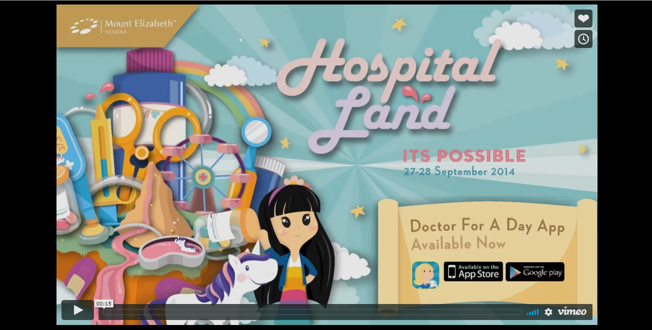
ToyFight
In ToyFight, after clicking on "View Project", the page loaded and the project page was shown, not animated like the other ToyFight pages. The year the project was done in, deliverables and teams involved, including other agencies, were listed on the left side of the website. As the user scrolled down, the task given, the process on how the final product came about and the marketing concept that was done to promote the product, with beautiful graphics to support every step of the way, which made the page interesting as it was presented like a story. At the bottom of the page, there was a link to go to the next portfolio work, which was helpful as the user was able to skip the animations in the Works page.
|
|
Cum. Creative
In Cum. Creative, after clicking one of the portfolio images, the user was given an overview of what the project was about and what the company delivered. It was wordy but there was a video of the project and still images as the user scrolled down. They don't show the process of how they conceptualised and produced the project like ToyFight. There was no link to go to the next portfolio work but due to the simplicity of the site, going to another portfolio work was easier compared to ToyFight.
|
|

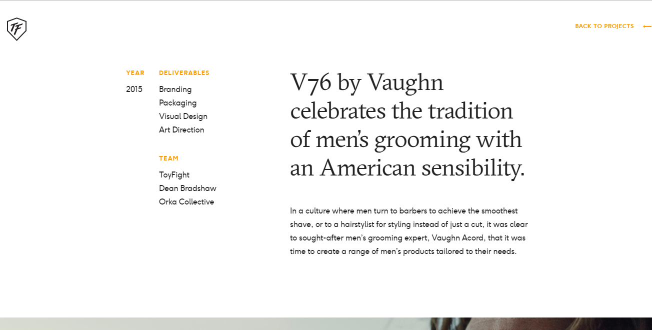
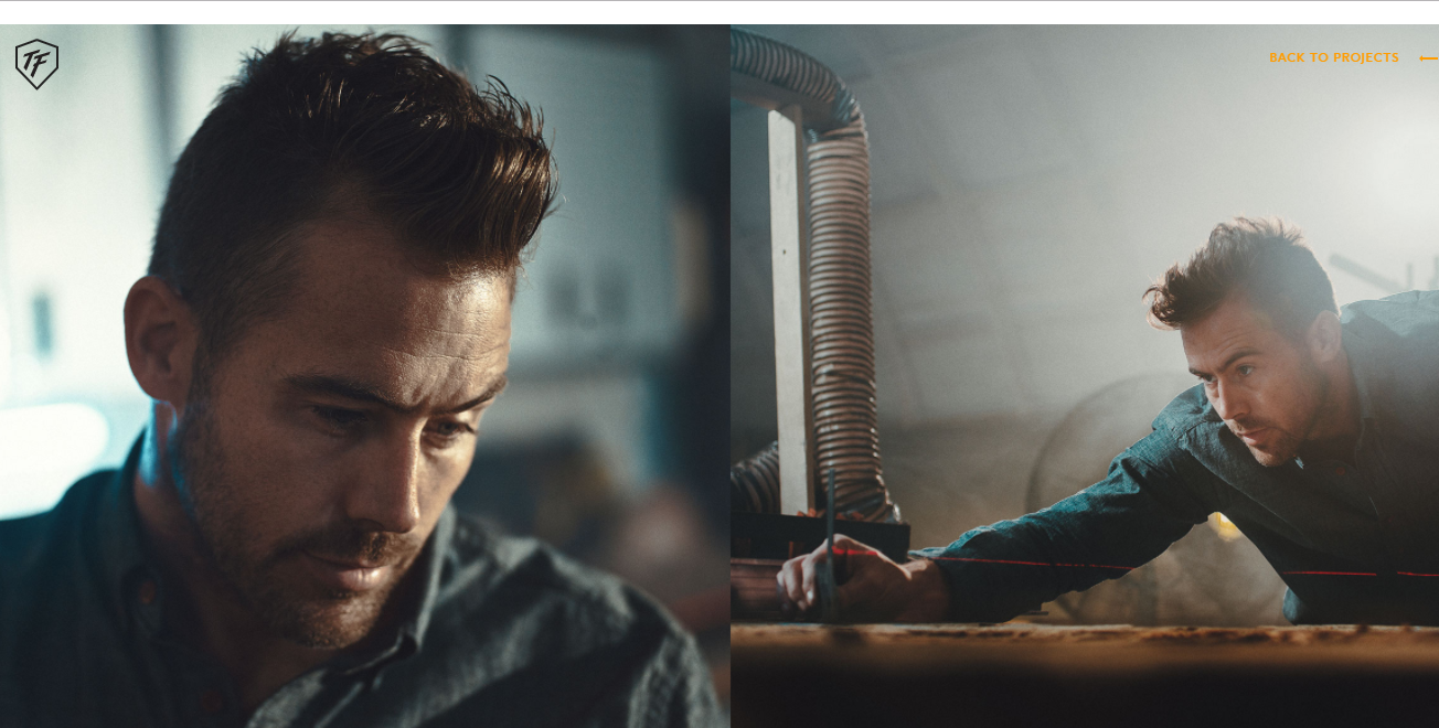
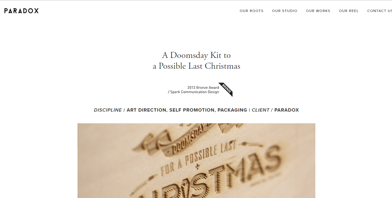
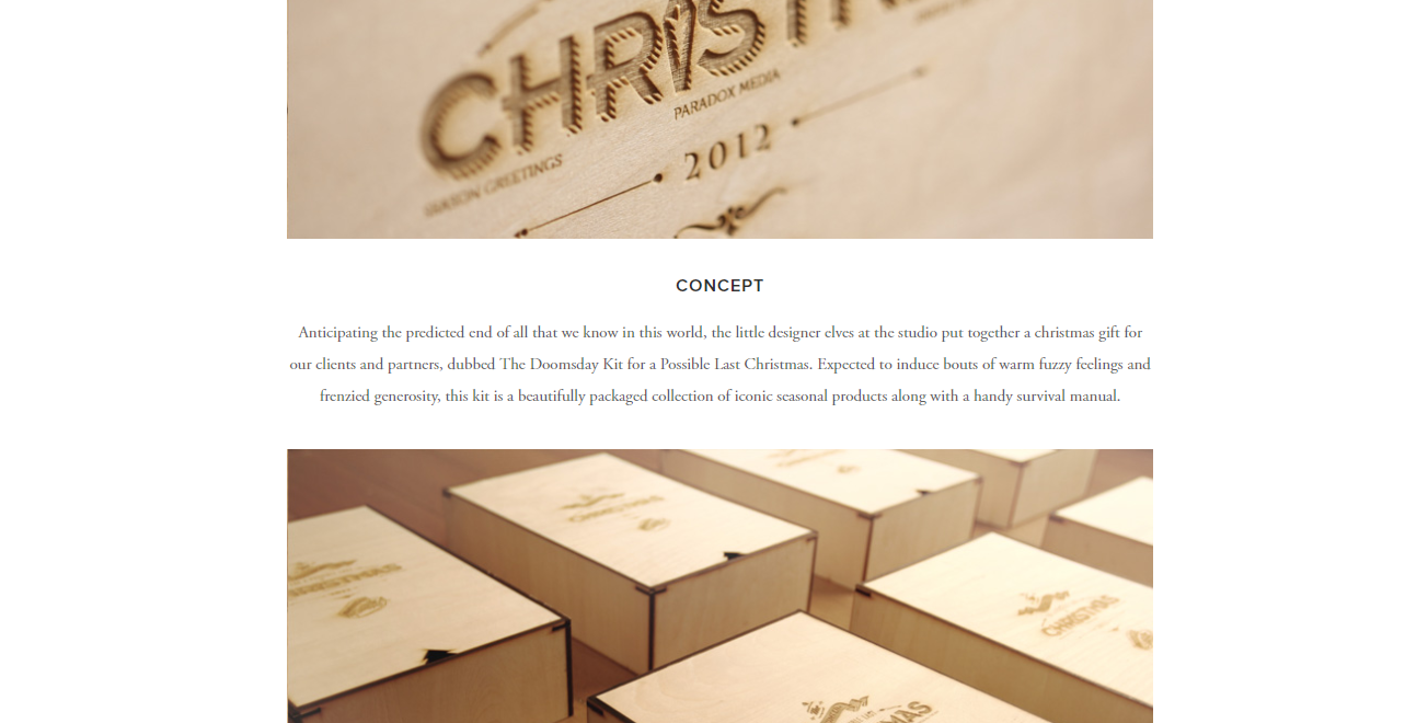
Paradox
In Paradox, after clicking one of the portfolio images, the title of the project was at the top, followed with the award won with the project and the services Paradox provided while doing the project. Like Cum. Creative, they had mentioned the concept of the project and showed the deliverables. They did not show their process. Like ToyFight, they used images to tell the story of what were their deliverables, though not why were these their deliverables.
Contact Page
|
|
ToyFight
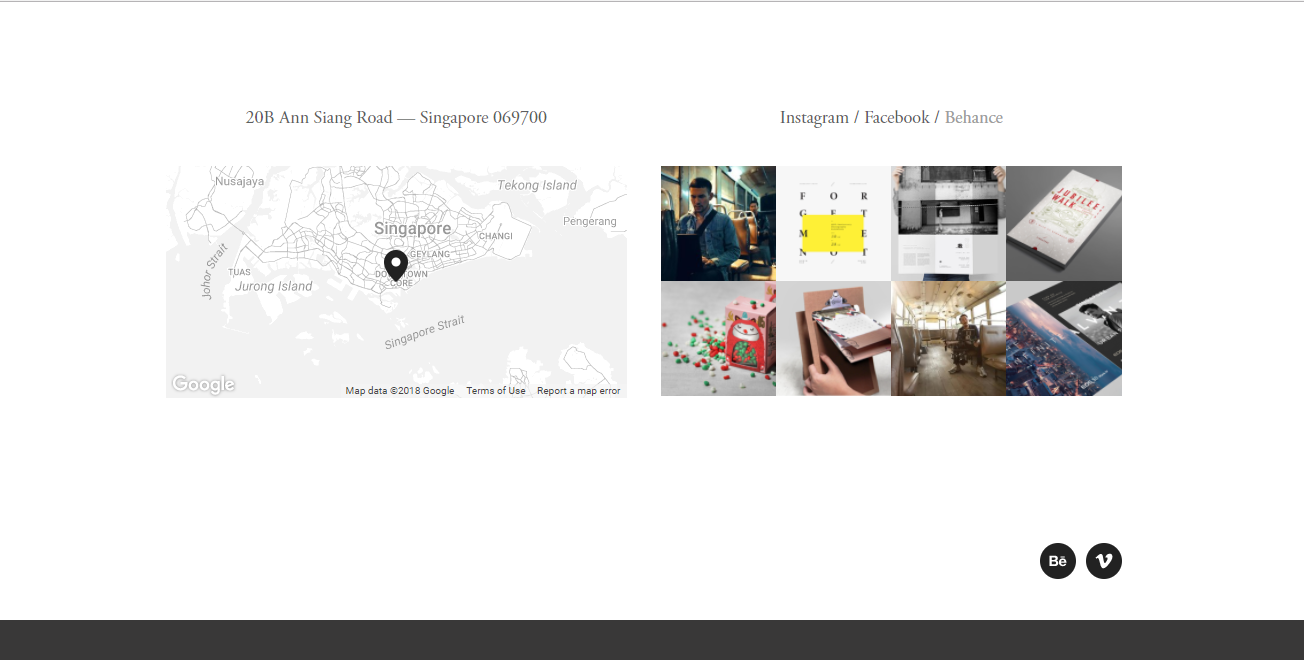
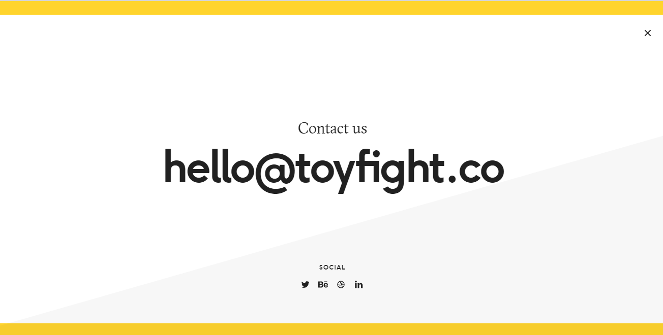
Upon clicking the "Contact" section in ToyFight, which was placed far apart from the other sections, the user would have expected another graphic header to appear. However, a pop up window appeared over the page showing the email address in a huge format while the social media platforms were very tiny in comparison, almost mistaking them as the copyright text. ToyFight did not reveal their phone contact. The user had to exit the window and scroll to the bottom of the page to get the company's address, which was troublesome.

Cum. Creative
For Cum. Creative, there was an email function in their Contact page which the user could contact them with, providing the user's email so they could get back to you. There was a Google Map by the email function with the address of the company shown on the top left of the map. Their phone contact was on the bottom of the screen, though it appeared small and almost unnoticeable.
|
|
Paradox
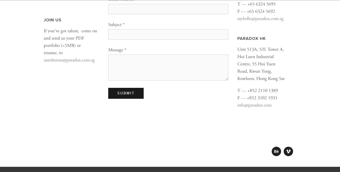
For Paradox's Contact page, like Cum. Creative, they had an email function as well. On the left, they wrote about the uses of the email function, getting in touch with Paradox about a project or sending the user's resume and portfolio (with size limit) if the user was interested in joining the team. On the right, they had placed the addresses of their two offices, Singapore and Hong Kong, with phone contact, fax contact and email address. Though it was great that there was information on how to get in contact with them, the page apart from the email function looked cluttered, making the user uncertain where to look at aside from the email function.
With the user getting information on contacting the companies, the user journey had come to an end.
With the user getting information on contacting the companies, the user journey had come to an end.
