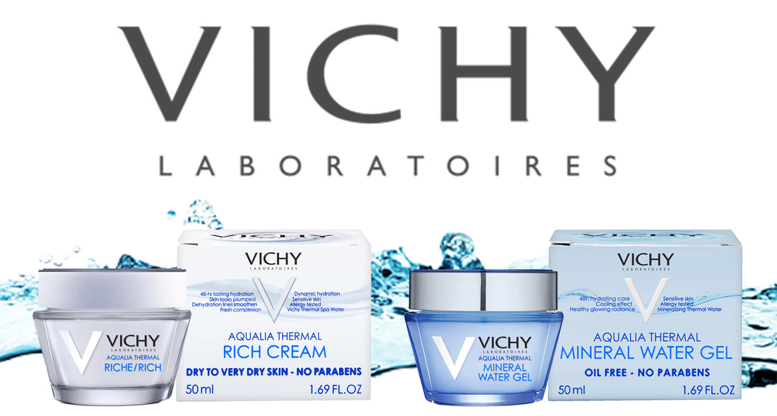
A little about Vichy Laboratoires... ...
|
Vichy Laboratoires is a dermatologically-tested skincare line from Vichy, France.
Its unique Vichy Thermal Spa Water contains 15 minerals that help individuals reach their ideal skin whatever their skin type, lifestyle/environment, age and skin concerns are. Their products aim to help men and women who combat oily skin and restore their skin’s hydration. The tagline of Vicy is "Health is beautiful". |
Case Study of Vichy Aqualia Thermal Product
|
I have very dry skin, despite the humid weather in Singapore.
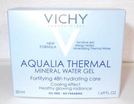
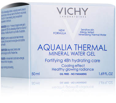
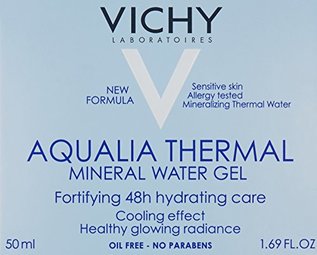
My introduction to Vichy was me asking a Watson staff member for recommendation for an oil free moisturiser, as my concern on using moisturiser beforehand was me having another problem while fixing my dry skin, which is pimples. The Mineral Water Gel was the product I was recommended and I bought it. |
|
My first impression was that the box packaging did not stand out to me. My only take that this was a high end product was due to the price being higher compared to other moisturiser brands I am used to seeing.
There was so many text on the front and the sides of the box. As a consumer, I did not have the patience to read all the text, I just asked the staff my questions. The Watson staff had to point out the 'Oil Free' text on the bottom when I wanted a confirmation that this was an oil free moisturiser. The text was very small and easily missed, which I felt it should be more noticeable, especially since it is a very important for people with acne or oily skin. |
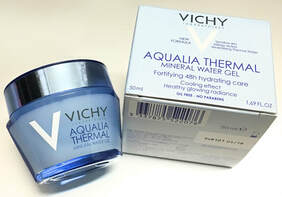
I was surprised and impressed when I opened the box and it revealed a very beautiful moisturiser container.
|
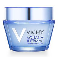
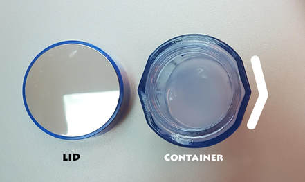
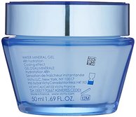
The bluish translucent container helps emphasise the mineral water element of the product. The translucency of the container is great for telling me whether I am running low on the gel; to help estimate when it will be time to go back to Watson.
There is as much text on the front of the container, unlike the box packaging, making it not as overwhelming to read. Not only is the container aesthetically beautiful, it us also functional, which I love! The structure of the container in the front view is shaped in a slight 'V' and on the top view, there are 'V' shaped sides, not only emphasises on 'Vichy', it helps with the consumer's grip on the container. The top of the lid has a reflective surface, a mirror, which helps when you have to apply the gel on your face and there is no mirror around to help prevent you from accidentally applying the gel on your eyes. |
The translucent water gel smelled pleasant and it was oil free. I was very happy with the product. Though, I soon realised quickly that I wish there was a better packaging design.
I was in a hurry one day and I needed to make a stop at Watson as I had used up my current supply of the Mineral water gel. I walked up to the counter, took a box from Vichy, paid for it and went home.
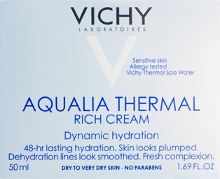
When I got home, I opened the box and realised that this wasn't the Mineral Water Gel. It was not a translucent water gel in the container. It was opaque white cream.
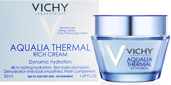
That was when I started to read the box packaging and realised I bought the 'Rich Cream' type. I can say, those few months of using the 'Rich Cream' type was accompanied with concern of a pimple breakout.
I was in a hurry one day and I needed to make a stop at Watson as I had used up my current supply of the Mineral water gel. I walked up to the counter, took a box from Vichy, paid for it and went home.
When I got home, I opened the box and realised that this wasn't the Mineral Water Gel. It was not a translucent water gel in the container. It was opaque white cream.
That was when I started to read the box packaging and realised I bought the 'Rich Cream' type. I can say, those few months of using the 'Rich Cream' type was accompanied with concern of a pimple breakout.
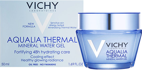
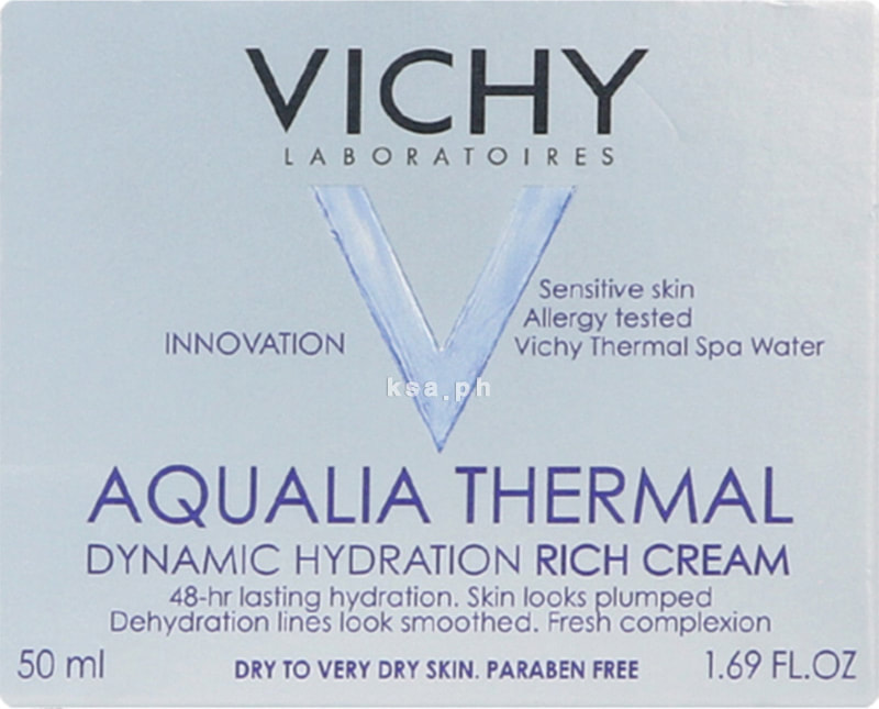
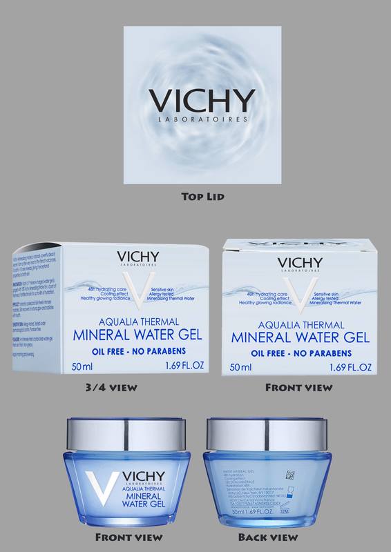
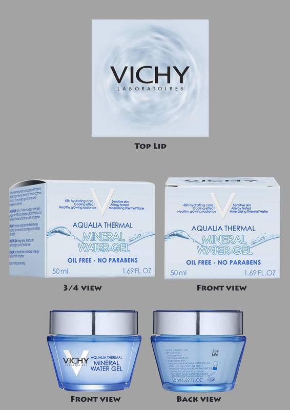
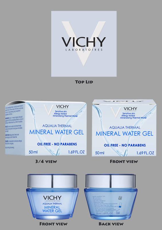
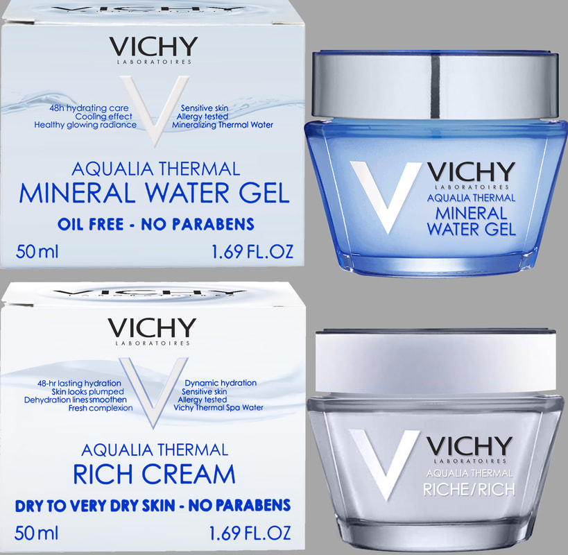
The Mineral Water Gel Box Packaging & Product
|
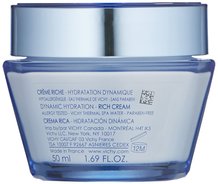
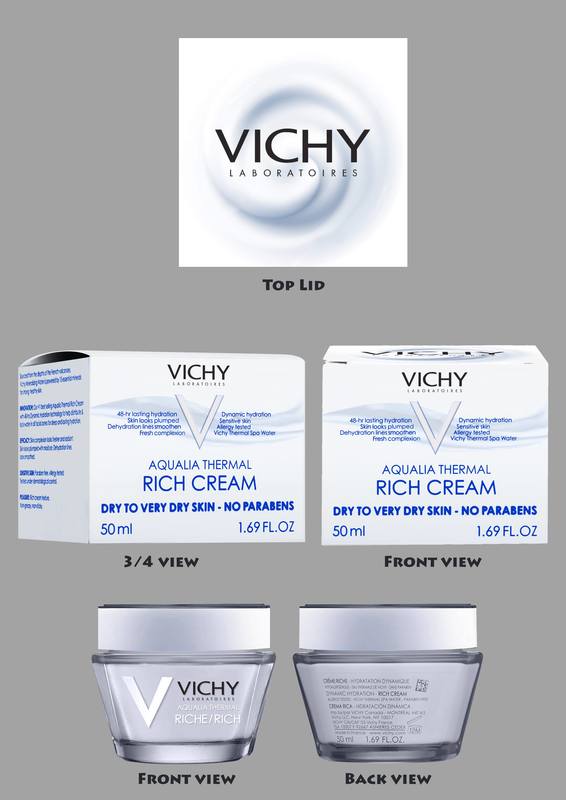
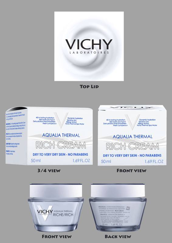
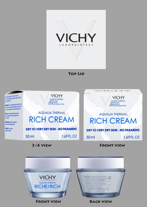
The Rich Cream Box Packaging & Product
|
The packagings of the two products are so similar in size and colour, except for the text, that it was no wonder that me, being in a rush, bought the wrong product. In a rush, I would only see silhouette and colour, I am not going to take a moment to read every single text. This led me to thinking, a redesign of the packaging is needed, to prevent confusion and mistakes.
The Process of Redesigning
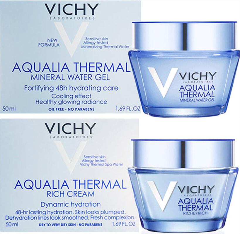
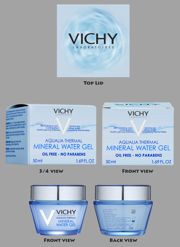
The Mineral Water Gel Box Packaging
|
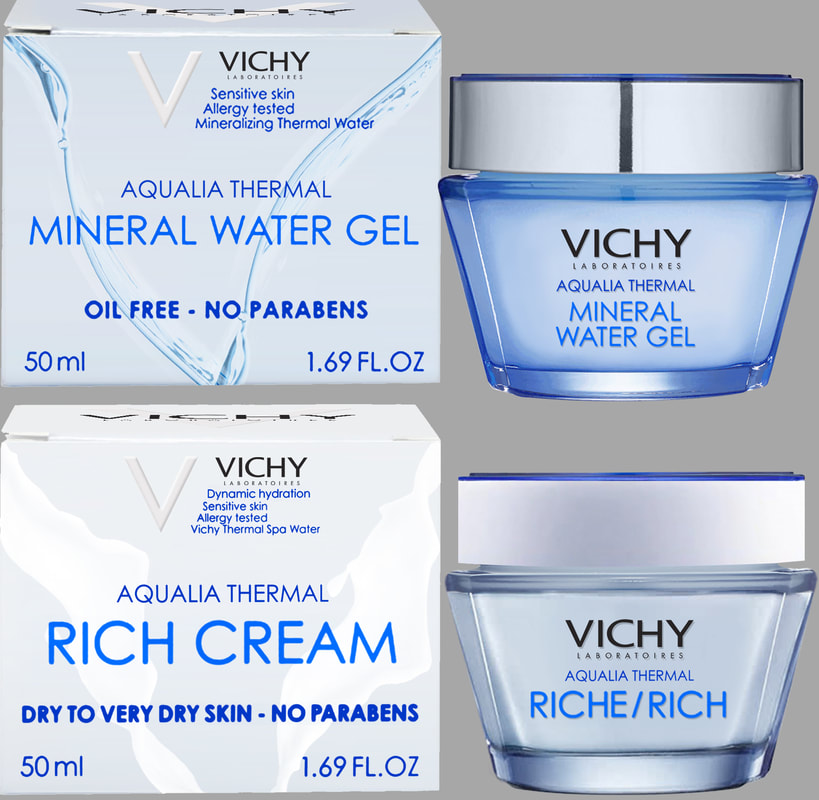
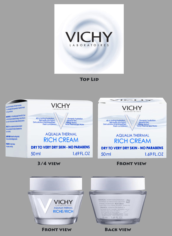
The Rich Cream Box Packaging
|
I started with looking at the box packaging of both products, as that will be the first thing consumers will see.
As I stated earlier, there are many texts on the front alone. I wanted to study the texts to see the reason why they had to be stated.
As I stated earlier, there are many texts on the front alone. I wanted to study the texts to see the reason why they had to be stated.
The English Information Section
|
The bottom of the box packaging
|
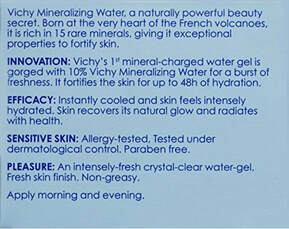
If you turn left from the front to the next side, it will be an Information section of the product.
Turn left again, it will be the front view of the product but in French. The fourth side is the Information section in French.
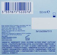
The last side, the bottom, is the bar code, manufacture and ingredient information.
Turn left again, it will be the front view of the product but in French. The fourth side is the Information section in French.
The last side, the bottom, is the bar code, manufacture and ingredient information.
Front of Mineral Water Gel
|
Back of Mineral Water Gel
|
Front of Rich Cream
|
Back of Rich Cream
|
I also started to look at the containers as well. Their containers are similar as well, and I feel the container should some difference as well, instead of me looking at what is inside the container through it's translucency.
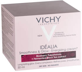
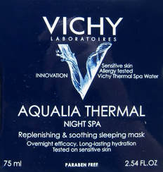
I also took a look at their other product packagings to see what has been done. I wanted to see what has been done, so as not to do something too similar, which will result in confusion. Also, maybe to get some ideas as well!
A cut out section that suggests the ingredients of the product.
However, in a rush, you will not be able to take note of the details. |
The 'V' is used as a graphic element to show the thermal spa water element of the product, with a subtle graphic background
However, the products I see in stores show the same product but with a bold white 'V' instead, making me think that this version was not well received. |
The 'V' compared to the other version does not have its silhouette altered but the water texture added on it.
However, it makes it less visible and outstanding, thus the bold white V we see on their packaging in stores. |
My takeaways are:
1. Their text are important
2. The 'V' is important and needs to be prominent
3. They like their packaging to be as simple as possible.
So how do I make the Mineral Water Gel and Rich Cream different?
1. Their text are important
2. The 'V' is important and needs to be prominent
3. They like their packaging to be as simple as possible.
So how do I make the Mineral Water Gel and Rich Cream different?
I went to look at other brands to see how they showcased their products.
Top section is of a different eye-catching colour. The type of cream is big and highlighted while other text are smaller.
|
Graphic element on the side to suggest ingredient. Different text are in different colours.
|
With the research I have done, I started doing some concepts of what I believe can work.
|
This is the first concept for the Rich Cream moisturiser I did.
I concentrated more on the box packaging than the container as I like the container and I felt the box packaging was more important as it is the first thing the customer sees. The Rich Cream's box as an off-white colour instead blue to show the cream aspect, but still within the blue range as it is to emphasize Vichy Thermal Spa Water. I took the descriptions at the bottom and placed them on the other side of the 'V' to balance the design. "Aqualia Thermal"is made smaller to give "Rich Cream" more importance and "Dry to Very Dry Skin" was enlarge as this information was too small in the original design for what I believe to be crucial details. I added a thick cream texture graphic on the lid to hint what is inside and the brand, giving more hints to the consumer what they are buying. The cream texture was also subtly placed on the front view, behind the "V" in a flowy form to continue the concept of the Vichy water. I made the side of the lid of the container water and the "Aqualia Thermal" and "Riche/Rich" fonts white, hinting to the cream quality of the moisturiser. I also felt for better differentiation, that the container colour be off-white as further hint on the rich cream aspect. "Aqualia Thermal"is made smaller and "Riche/Rich" is made bigger to give "Riche/Rich" more importance. |
|
This is the first concept for the Mineral Water Gel moisturiser I did.
Adopting what I have done for the first concept of the Rich Cream moisturiser, the Mineral Water Gel's box a light blue to show the water aspect . I took the descriptions at the bottom and placed them on the other side of the 'V' to balance the design. "Aqualia Thermal"is made smaller to give "Mineral Water Gel" more importance and "Oil Free" was enlarge as this information was too small in the original design for what I believe to be crucial details, especially for me who is worried about a pimple breakout. I added a water texture graphic on the lid to hint what is inside and the brand, giving more hints to the consumer what they are buying. The texture does not cover the whole lid as I felt it was be too much and to suggest the container's shape. The water texture was also subtly placed on the front view, behind the "V" in a flowy form to continue the concept of the Vichy water. I made "Aqualia Thermal"is made smaller and "Mineral Water Gel" is made bigger to give "Mineral Water Gel" more importance. |
|
|
This is the second concept for the Rich Cream moisturiser I did.
This version was edited from the first. I took away the "Vichy Laboratoires" from the front of the box as it is already on the lid to give more breathing space in the front. I adjusted "Aqualia Thermal", "Rich Cream" and "Dry to Very Dry Skin" for more breathing space to help with readability and added a cream texture subtly placed behind the "Aqualia Thermal" and "Rich Cream" in a flowy form to continue the concept of the Vichy water with the cream aspect. "Rich Cream" was given a different colour and has a stroke effect to bring attention to it from the all blue fonts on the front. I placed "Vichy Laboratoires" over the "V" on the container to increase space and centralise "Aqualia Thermal" and "Riche/Rich" next to the brand. The words were darken for visibility and the container was given a more bluish tint to it to make the water aspect stronger yet not forgetting about the cream aspect. |
|
This is the second concept for the Mineral Water Gel moisturiser I did.
Following what has been done for the second concept of the Cream moisturiser, I took away the "Vichy Laboratoires" from the front of the box as it is already on the lid to give more breathing space in the front. I adjusted "Aqualia Thermal", "Mineral Water Gel" and "Oil Free" for more breathing space to help with readability and added a water texture subtly placed behind the "Aqualia Thermal" and "Oil Free" in a flowy form to continue the concept of the Vichy water with the cream aspect. "Mineral Water Gel" was given a different colour and has a stroke effect to bring attention to it from the all blue fonts on the front. I placed "Vichy Laboratoires" over the "V" on the container to increase space and centralise "Aqualia Thermal" and "Riche/Rich" next to the brand. The container was remains blue to following the water aspect of the product. |
|
|
This is the third concept for the Cream moisturiser I did.
I was going for the non-graphic, simple style, similar to one of my references. I brought back the "Vichy Laboratoires" to the front, putting it at the bottom of "V" for better representation. I was going to use a darker blue colour to emphasize thickness and opaqueness, as cream is. I ended the colour below "Vichy Laboratoires" to guide the eyes and show "Aqualia Thermal", "Rich Cream" and "Dry to Very Dry Skin" as the main points to take note when buying the product, grouping the fonts so that the buyer doesn't feel overwhelmed by all the text. "Rich Cream" is of a different saturation to bring focus to it, showing importance. I made the side of the lid of the container water fonts the same blue used on the lid for consistency with the packaging. I made the "Vichy Laboratoires" smaller and under "V" so that the buyer can see both different versions of the brand were together, then the product name next to it. |
|
This is the third concept for the Mineral Water Gel moisturiser I did.
Continuing for the non-graphic, simple style like the third concept for the Cream moisturiser, I used a white colour to emphasize clearness and transparency of water. I ended the colour below "Vichy Laboratoires" to guide the eyes and show "Aqualia Thermal", "Mineral Water Gel" and "Oil Free" as the main points to take note when buying the product, grouping the fonts so that the buyer doesn't feel overwhelmed by all the text. "Mineral Water Gel" is of a different saturation to bring focus to it, showing importance. I made the "Vichy Laboratoires" smaller and under "V" so that the buyer can see both different versions of the brand were together, then the product name next to it. |
|
|
This is the fourth concept for the Cream moisturiser I did.
I overlapped "Vichy Laboratoires" over "V" on the lid as I love the aesthetics of the two combined. I took away the fonts about the benefits of the product as I felt that it was too much and felt overbearing too. This led to me putting "Vichy Laboratoires" on top of the main points of the product, next to "V" to give a pyramid feel. I placed cream graphics at the back to form a 'V' to emphasize on both the cream and brand aspect of the product. I decided to try a version of the container without the "V" as I felt the box packaging has showed case "V" a few times already. This led to have "Riche/Rich" being bigger, so the product name is showing more. The white of the side of the lid is to show off the cream aspect |
|
This is the fourth concept for the Mineral Water Gel moisturiser I did.
I overlapped "Vichy Laboratoires" over "V" on the lid as I love the aesthetics of the two combined. I took away the fonts about the benefits of the product as I felt that it was too much and felt overbearing too. This led to me putting "Vichy Laboratoires" on top of the main points of the product, next to "V" to give a pyramid feel. I placed water graphics at the back to form a 'V' to emphasize on both the cream and brand aspect of the product. I decided to try a version of the container without the "V" as I felt the box packaging has showed case "V" a few times already. This led to have "Mineral Water Gel" being bigger, so the product name is showing more. |
|
The final part of the redesign was me asking some people which one of the four concepts I have done would they prefer. I also gave them the option of choosing the original design if none of the four concepts appealed to them.
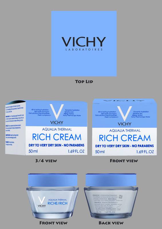
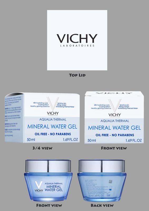
The first option of the box packaging and container were the most popular according to the interviews, the fourth option being the second favourite.
When I asked why, the answer was that the text are clear for readability and the placement is clean. The graphics of the cream and water does not clash with the text. Though the graphics of the cream and water forming a "V" in the fourth option intrigued them, the interviewees said they place more importance in the text.
When I asked which will they choose if the choice was between the Original design and the first packaging and container option, they chose the latter. The reason was that their impression of the original was that the outlook was plain and too similar which will lead to confusion. The new designs will help avoid confusion and get them interested in buying the products due to the presentation.
The Original Designs
|
The Fourth Option
|
The First Option
People's Choice |
The process was not over yet!
It has been mentioned that though the first option of the box packaging and container were the people's choice, there were suggested changes.
As interesting as it look, the interviewees felt that the "Mineral Water Gel" box packaging can be more blue to have a better differentiation of the two products. The text on the Rich Cream container needs to be more readable.
With that in mind, I proceeded to edit the first option of the box packaging and container.
The changes made were:
1. I made the Rich Cream container brighter and less dull, closer to emphasising cream colour,
2. The text colour on the Rich Cream container for "Aqualia Thermal" and "Riche/Rich" are blue, but the latter being a more saturated and lighter blue are differentiation, which was also done on the Mineral Water Gel container text.
3. The font colour for "Rich Cream" and "Mineral Water Gel" on the box packaging is more saturated and light colour of blue for differentiation of text.
4. I decrease the amount of black in the water texture of Mineral Water Gel for readability and making it closer to water colour
The changes resulted in the current redesigned product of Vichy Laboratoires Aqualia Thermal Rich Cream and Mineral Water Gel!
|
|